As Derek Murphy of creativindie.com tells all independent authors (and I highly recommend his books, courses, and articles), covers serve but one purpose: to draw the eye of the potential customer and immediately convey the genre of the book.
Keywords in titles can help, but the overall impression of the image or images on the cover is what truly impacts browsers. Images and colours convey a mood. Standard cliché image types (like the sexy bare-chested man on the front of a Romance tale or the dark brooding atmosphere of the Thriller) instantly tell a buyer what the book is about.
Genres also have common font design, like the swirls of Romance and Chick Lit, the mid-letter horizontal spikes of Western fonts, the ultra-stylized sans serifs of Scifi, the unusual shapes on Fantasy books, the bladed or bloody letters of Horror. While one could use the exact fonts found on titles of a particular genre, mimicking the overall look is what will have the impact.
And varying the size and font from title to subtitle to author name helps to stress the most important of these. Colour of text may also enhance (or detract from) the impression given by the cover images.
All in all, if you’re looking to make a living selling books, making sure the cover grabs the right readers is crucial, followed by a good blurb to entice those who are attracted enough by the cover to bother reading it.
Ultimately, though, a story that does not disappoint the reader is what sells future books.
Do you choose books by the cover? If you are a writer, have you checked out creativindie.com?
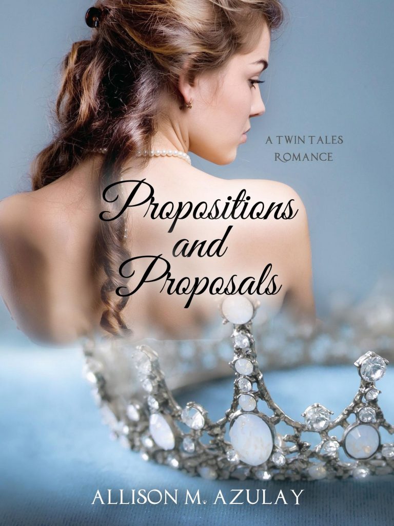
[Cover design above by SelfPubBookCovers.com/TinaPappasLee]


Yes, I do usually pick up a book because of the cover colour and photo, then read the summary of the book before making a final decision to read it.